
User Research & Redesign
The Wonderful Company
Generative Research: While working at the Wonderful Corporation, I discovered a need to improve the Technical Services and Wellness Center intranet pages. I often heard manufactuting engineers complain that the website wasn't mobile friendly, leading me to question if our intranet needed a redesign. This began a larger user research and redesign project where I uncovered major friction points and addressed user needs.
Task: Redesign the technical services and wellness intranet pages. The technical services site needed better information architecture and mobile design. Whereas the Wellness Center Intranet pages needed to accommodate Spanish speaking employees so all personas could access the on-site health center information.
Originally the Wonderful intranet pages were composed of lists of hyperlinks with no intuitive nature behind the design, making it difficult for users to navigate.
My role: UX researcher and designer.
Use-case: A Wonderful employee visits the intranet site in order to either fill out a tool request, enter manufacturing plant data, or to obtain wellness center information.
Challenges: I underwent this user test in March 2020 when we were sent home for the pandemic. This made user interviews difficult since I had never done remote user testing. Thankfully with the help of online tools I found remote testing to be very helpful and have continued to ustalize the method for many years after.
Discovery
System Model
.png)
First I went broad, by understanding the many roles that relied on the technical service and wellness pages.
After reaching out to multiple departments I narrowed users into four distinct groups who used this intranet site. Two personas stood out as having major friction points. I conducted remote moderated user surveys with both personas.
The project managers(Expect users) said that contracted engineers(new users) struggled navigating the intranet site. I interviewed a group of engineers to complete a time on task test on the original page. Contract engineers spent time the longest navigating through confusing navigation and UI.
Another group that expressed friction points during my ethnographic generative research were primarily Spanish-speaking hourly employees who found the wellness center page unhelpful due to lack of accessibility. I asked a group of these users to complete the task of finding how to make an appointment and where the wellness center was located. Only 25% of the users succeeded in completing this task.
Personas
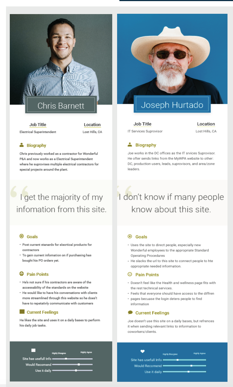
There were two opposite personas that relied on these intranet pages. Chris represents the supervisor and expect persona who regularly logged into the site to submit tool purchase requests. The second persona represented contractors and employees who rarely visited the intranet pages and often were primarily Spanish speaking so accessibility and intuitive design became imperative in the redesign.
Storyboards
Technical Services
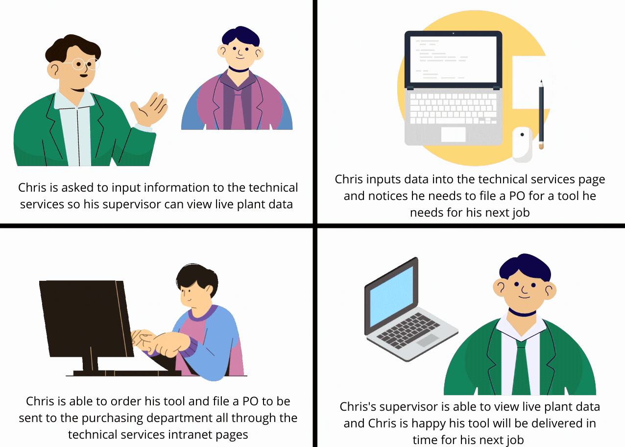
I created a story board to understanding the purpose of these intranet pages. I found, a main use of the website was for contractors and engineers to retrieve and input information into the technical services data tables. Full time engineers considered themselves as expert users and had memorized with links they depended on. However, temporary contractors considered themselves as new users and often struggled finding where to find and input information.
Wellness Center
.gif)
During initial interviews I found hourly employees spoke primarily Spanish and relied on word of mouth to figure out how to access the wellness center. This lead me to believe the wellness center site needed to be more accessible for Wonderful's primarily Spanish speaking employees and their families.
User flow
Closed Card Sort
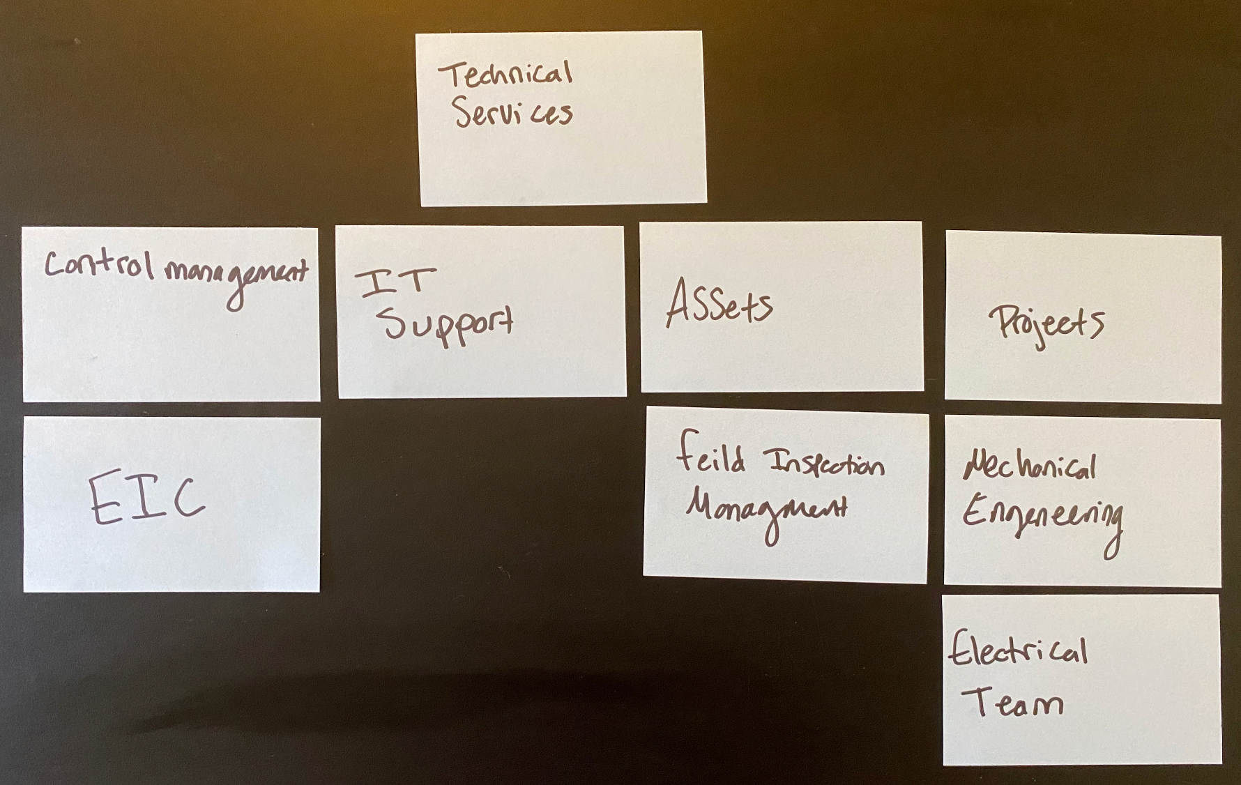
Information architecture was a crucial aspect to maintain while constructing the redesign. The previous website was a list of hyperlinks without design to help users intuitively navigate the page contents. We wanted to create a flow of information that was both intuitive and familiar for users. After a moderated in person card sorting session with both full time and contract engineers the above IA is what we settled on for the redesign.
User Flow
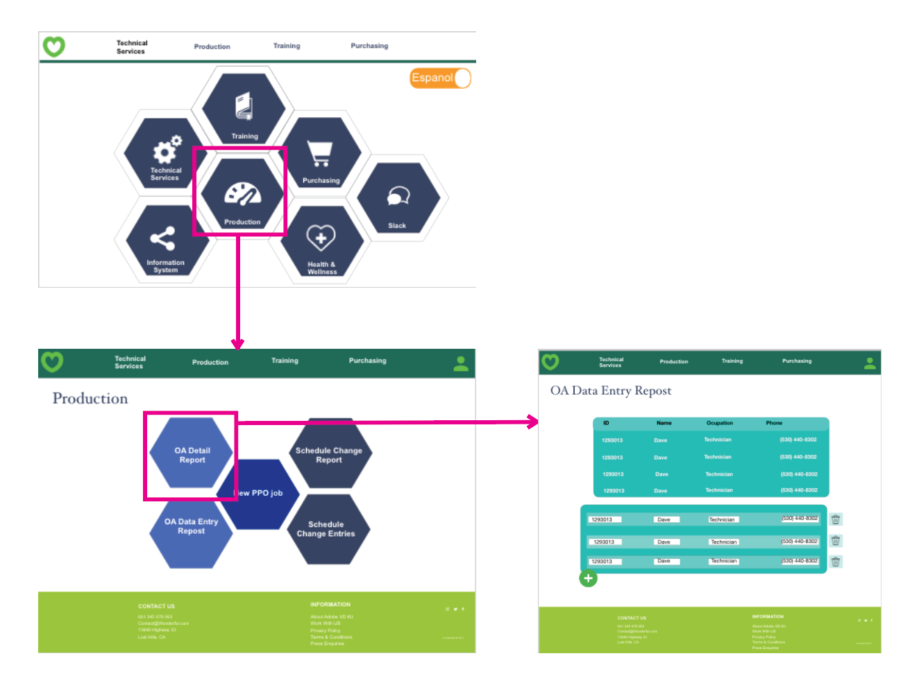
This is one example of the user flow after implementing the information architecture changes.
UI Design
Low Fidelity
I made a low fidelity prototype to test against a few users to assess their initial thoughts.
Interactive Prototype
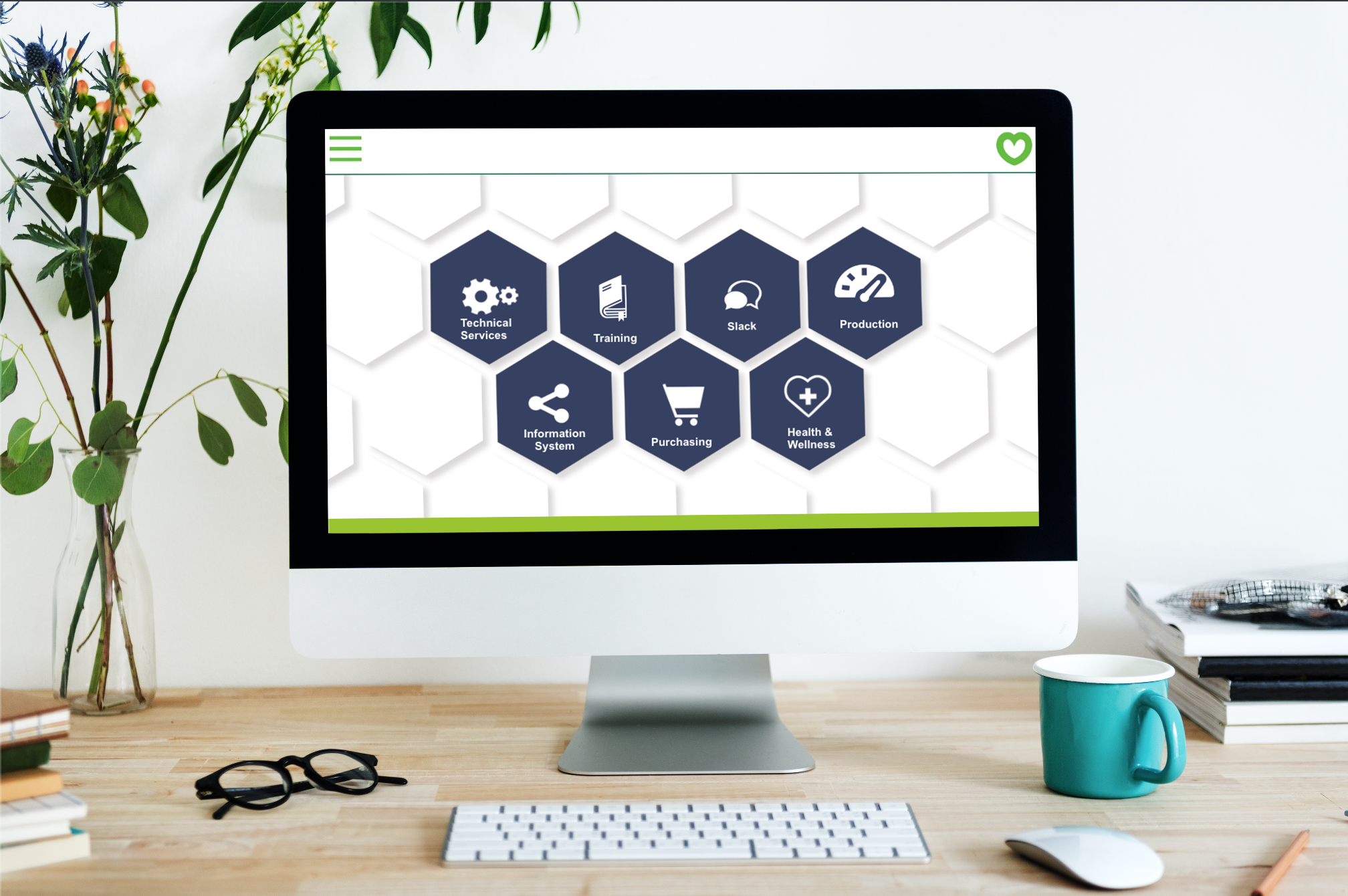
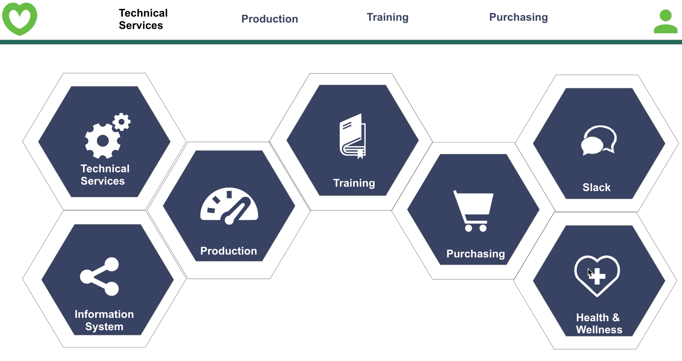
Then, I made a higher fidelity prototypes in Adobe XD based on the needs determined in our previous research. My manager requested a geometric inspired design so we implemented an offset hexagon layout.
User Testing
After we had a working prototype I conducted rapid experimentation to test the new engaging user interface, information architecture and accessibility features. I tested users who had not participated in the previous test to keep user familiarity as constant as possible going into the test.
I used the lookback.com platform to conduct moderated remote user tests.
Impact
This redesign has had a significant impact by enhancing accessibility for both experts and new users, facilitating the input and access of crucial plant data to be shared across departments within the company. Through the implementation of accessibility features, we've successfully amplified users' capacity to leverage this valuable information. The overall result of the redesign is a more time-efficient experience for engineers as they navigate the site.
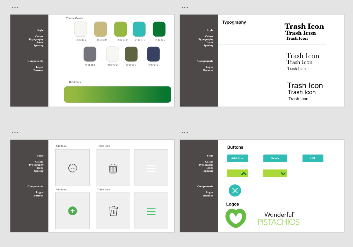
Design System
I stayed consistent with Wonderful’s current design system, integrating hues of green and their familiar heart logo. We made the buttons vary in size and color to indicate priority. By adding more colors, shapes, and icons the page was more engaging and delightful for users. We also added a switch in the upper right hand corner of the design to make the site bilingual for Spanish speaking users.
Deliverables
Oftentimes, Wonderful would use rapid development to the point that user research would be skipped. I created the above booklet with various UX examples, including scenario mapping, user journeys, etc., to help my department's UI/UX future development.
Other Projects
.png)

.png)
